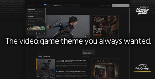
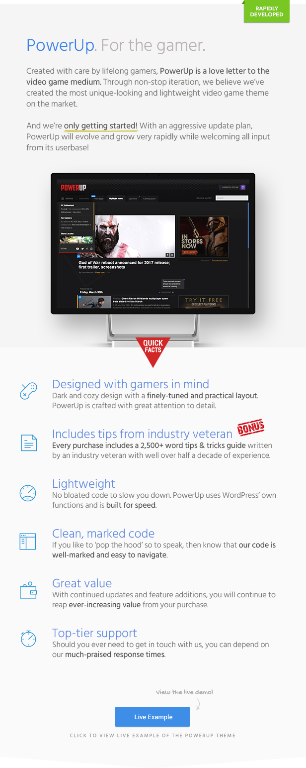
PowerUp is the WordPress theme built for the video game enthusiast. Whether you already run a gaming site or are looking to start one up, PowerUp is the tool for the job. Our goal was to achieve a dark, detailed, super-unique design that carries an awesomely old-school yet still modern look and feel that’s pitch perfect for sites related to video games. With several unique new features already in the works and more planned for the future, you can expect PowerUp to be levelled up on a regular basis.
Built from experience
Having operated several gaming sites for over half a decade, we discovered it to be crucially important how effortlessly and rapidly writers can publish their content. In a world where video game sites are constantly trying to get that sweet social media traffic as well as one-up each other to be the first to get their stories published on news aggregator sites, there’s simply no room for bloated themes and add-ons that bring webservers to a crawl upon installation.
Beating your rivals to the punch when submitting your content to sites like N4G is often not a matter minutes but quite literally seconds. If you’re not the first to submit that big news story or awesome gameplay reveal that was just released, you won’t be getting the traffic that especially up-and-coming game sites so often rely on.
The publishing process becomes even more crucial during press conferences and events like the approaching E3 Expo this June. The amount of news coming out of that single event alone is colossal, and as someone who lived and survived through four E3s, I can say that tripping on your own shoelaces so to speak is the last thing you want happening.
To that end, we made sure PowerUp is a fast and bug-free theme at launch. No one likes it when multiplayer games have bad netcode or when gameplay essentials are patched post-launch. The same holds true when a theme’s launch is followed up by weeks or even months of bug fixes. With our past product releases, we’ve proven time and time again that “fix it later” does not exist in our vocabulary.
Designed with the visitor in mind
The PowerUp theme is very purpusefully designed to be a tight package with a clean and practical layout. The visitor doesn’t need to scroll multiple screens’ worth or deal with other annoyances just to reach the content they came there for in the first place. It goes without saying that once you get someone to visit your site, it is oh-so-very important that nothing gets between them and your content. If navigating your site is confusing or downright annoying, few will be vocal about it, most simply won’t come back.
Easy to understand, well tested
In consideration of those looking to roll up their sleeves and make custom edits, our code is well-marked as usual. Taking this approach with our WordPress products and combining it with meaningful updates and thorough testing across a range of devices is something our customers have appreciated for years.
To wrap up…
We love video games. When at its best, gaming is simply the best form of entertainment around and we couldn’t be happier to contribute to this world by creating this WordPress theme. PowerUp is a passion project that will continue to grow and evolve in the coming weeks, months and years, both based on our vision for it as well as feedback from our customers.
Please be sure to visit the demo site here to see a live example of PowerUp, and do read through the different posts there to dive a bit more into the nitty-gritty of this gaming theme. Thank you!
Features:
- A dark, detailed and super clean layout perfect for video game sites
- Optional ‘highlighted’ content feature: bring more attention to important stories by color-marking them for easy scanning
- Possible to add marker to header tabs and link to all highlighted posts
- Optional featured content slider on front page along with a widget location intended for an ad placement (300×250 unit)
- Optional trending stories news ticker below header
- Displays most commented on stories published in the last week
- Dropdown navigation:
- unique three-level menu
- social icons
- unstyled widget location
- customize dropdown menu width/height
- snaps to full-screen at mobile resolutions (customize exact resolution)
- customize “Browse” button text
- Tabbed header navigation:
- option to mark a tab with customized text
- optionally, add custom prefix text to tab area
- single-level navigation
- Widgetized sidebar and footer
- Fast and lightweight for maximum publishing speed, no bloated code or slow plugins
- Clean and well-marked code
- Thoroughly tried and tested across a range of devices
- Proven author with fast and friendly support
- Lifetime free updates
- Jargon-free documentation


