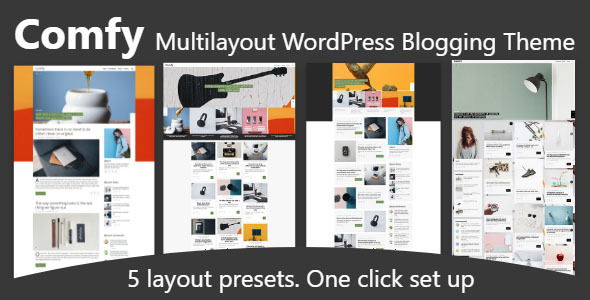
Comfy. Responsive WordPress theme for blog or magazine
Theme key features:
- Boxed and full screen header
- Boxed and full screen footer
- Featured posts carousel with 5 styles. Boxed and full screen versions.
- Select post category.
- Enable or disable carousel on home or single post page.
- Enable or disable carousel on mobile devices.
- 3 Home page layouts.
- Classic. Narrow and wide content area
- Masonry. Boxed and full width
- List. Thumbnail positions: left, right and chequerwise
- 3 Post thumbnails:
- Image.
- Video.
- Carousel.
- Post thumbnail position:
- Above Title.
- Below Title.
- Different positions in the home and single post.
- Continue button position:
- Left.
- Right.
- Related posts carousel:
- On home or single post pages.
- With big or small thumbnails.
- Two post navigation styles:
- With numbers.
- With text.
- Popular posts crousels at the top or at the bottom of the site. Boxed and full screen
- Likes
- Narrow and wide sidebars
- Sidebar positions: left, right, none.
- Footer sidebars. Boxed and full screen
- Header and footer menus.
- Footer social menus.
- Social share icons.
- Masonry grid gallery.
- Lightbox.
- Google fonts.
- Font Awesome icons.
- Responsive.
- Bootstrap 3.3.5 + Underscore.
Widgets included:
- Recent comments with gravatars.
- Recent, Popular, Best Reviews and Random Posts with images.
- Advertisement (Graphic or Text Advetisement).

