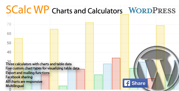
SCalcs generates three different interactive financial calculator and custom charts which are generated from tables. Every native HTML tables can be visualized as line, bar or radar chart.
All charts can be exported or sent by mail. Custom charts can be shared also on facebook.
Key Features
SCalc uses shortcodes to integrate in pages, posts or widgets (if your widgets supports shortcodes)
Important Links
Installation
The download archive contains to plugins: SCalc and sk-library.
You must install both within the wordpress plugin panel. Activate first sk-library and then SCalc.
If you already have installed sk-library in version 1.3 you can omit this installation.
SCalc contains an update checker so that you will be informed about plugin or library updates.
Shortcodes
Calculators
Basically there are three possibilities:
All basic settings and colors are made by the SCalc settings in the Settings panel. You will have three more options:
type: as shown above
height: pixel or percent numeric (i.e. ?100%? or ?300? for 300 px) (optional)
width: same as height
Be careful with width and height: Since charts are responsive, adjustment of width and / or height may lead to unwanted results.
Custom Charts
To add a custom chart you will need to things: The shortcode and a data table from which SCalc generates the datasets and labels.
Example:
[schart type="line" symbol="?" height="300" width="200" show_table="1"]
Here is the place for the table. It must be a valid HTML table.
[/schart]
Colors can be set in the Settings panel SCalc. Same colors will used for calculators and custom charts.
The options:
type: line, bar, doughnut, pie (mandatory)
symbol: Appendix for labels and legends (i.e. $) (optional)
height: pixel or percent numeric (i.e. “100%” or “300” for 300 px) (optional)
width: same as height
thousands: , or . (defaults to ”,”. If your table data contains formatted numbers you must set this according to data format)
decimals: , or . (defaults to ”.”. If your table data contains formatted numbers you must set this according to data format)
show_table: “0” or “1” Display the data table or not (optional)
Be careful with width and height: Since charts are responsive, adjustment of width and / or height may lead to unwanted results.

