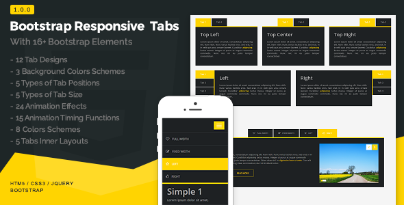
Bootstrap Responsive Tabs
Bootstrap Responsive Tabs are built with Bootstrap and jQuery. It contains bootstrap carousel, slider, image gallery, lists, table, progress bar and different types of form. It also supports YouTube, Vimeo and self hosted videos with new features. You can change each and every thing such as colors, animations, sizes, backgrounds, positions etc by just changing the classes. We have added many new functions those increased the flexibility of the product.
Elements
Bootstrap Carousel
The carousel used in this product is a bootstrap carousel. There are five types of carousel according to the grid system.
- 2 columns
- 3 columns
- 4 columns
- 5 columns
- 6 columns
Bootstrap Slider
There is one slider included in this product that has types of full width and fixed width with text layers. Other than that we can display the slider either on the left side or the right side with other content easily in bootstrap responsive tabs.
Bootstrap Image Gallery
The image gallery is also categorized in five grid views. And it is 100% responsive.
- 2 columns
- 3 columns
- 4 columns
- 5 columns
- 6 columns
Image
The images can be displayed in four different styles top, left, right and bottom easily.
Self Hosted Video
To display self hosted video in tabs HTML 5 tag has been used.
YouTube And Vimeo
YouTube and Vimeo videos can also be embedded in the responsive bootstrap tabs and can be displayed left and right side easily with other content.
iframe
iframe help you to embed other websites on your site. You can embed it in tabs easily.
Bootstrap Table
We have included bootstrap tables in the tabs. You can display it left, right, top and bottom anywhere in the tab. The tables are also responsive.
Bootstrap Progress Bar
We have included the bootstrap progress bars in this pack. There are two types of progress bars, animated and simple. Now you can show your data in the form of bars easily.
Bootstrap Sign In Form
You will also find sign in form in bootstrap responsive tabs. The forms are 100% responsive and well designed. You can appear them anywhere in the tabs.
Bootstrap Sign Up Form
Sign up form is also a key element of the bootstrap tabs. It can be displayed left, right, top and bottom in the tabs.
Bootstrap Contact Us Form
Responsive Bootstrap Tabs also has the function to show a contact us form with 100% responsiveness.
Bootstrap Subscribe Form
Subscribe form has a great value in modern websites. So, we have designed it in the tabs.
Combine Elements
You can easily display different elements in different tabs.
Features
Responsive
Size of tabs is responsive on each and every device. Bootstrap Tabs are easily adjustable on every device according to screen resolution.
Customization
We can change each and every thing such as colors, animations, sizes, backgrounds, positions etc by just changing the CSS classes.
Mobile Friendly
Dynamically responsive on all mobile devices. Bootstrap Tabs are completely mobile friendly and as well as it is responsive on iPad, tablets and all other devices.
Bootstrap
Responsive Tabs are built with bootstrap v3.3.7. Even the elements those have been used in the tabs are also built in bootstrap.
Browser Support
Bootstrap tabs are compatible with all browsers like Chrome, Firefox, Internet Explorer, Opera, Safari, Maxthon and edge.
Documentation
Clean and clear documentation with briefly explained each and every part of bootstrap responsive tabs.
Support
We are always there for your help. You can contact us any time. 24/7 support enables user to overcome any problem about tabs.
Validate
The code of bootstrap tabs is clean and clear. The comments help you out to easily understand and edit the code. Validated from W3 Consortium.
Vertical Tabs
A bootstrap responsive tab is built in such a flexible way that you can easily convert any horizontal tab into vertical tab.
Videos
You can embed YouTube and Vimeo videos easily in bootstrap tabs. You can easily host your own videos with the help of HTML 5 video tag.
SEO Optimized
It is completely on page and off page SEO optimized. You can shrink your content by using tabs and maximum content can also be added on a page.
Updates
Updates are free and always will be. Plug-in used in Bootstrap Responsive Tabs are fully up to date.
Plug-in Used
Photos And Videos
Note: Images and Videos are not included in the pack.
