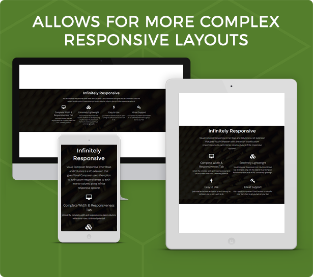
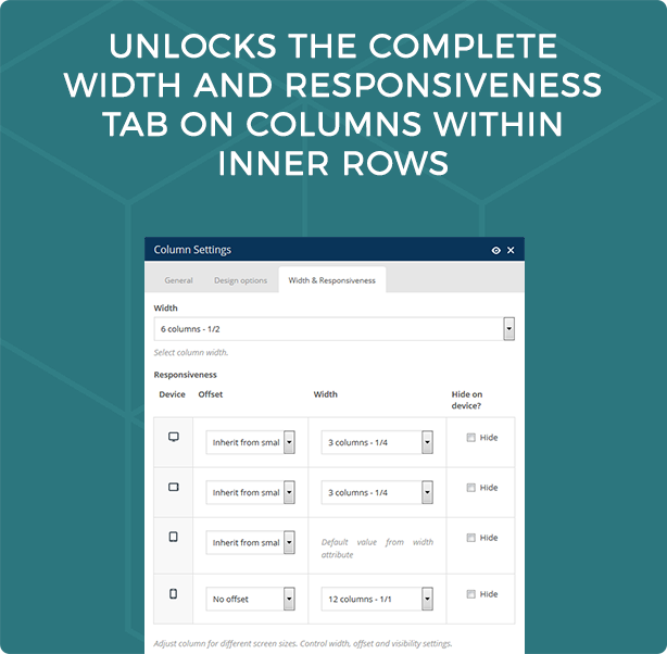
Visual Composer Responsive Inner Rows and Columns is a VC extension that gives Visual Composer users the option to add custom responsiveness to each interior column, giving infinite responsive options. The non-extended version of Visual Composer only allows users to choose individual column responsiveness in a primary row… but what if you want to have completely responsive columns within rows within rows?
For example, you have a row with a parallax background image. Within this row you want to have a title on one line and then four icon/text blocks on the next line. You also want these four icon/text blocks to be distributed as 4 per line on a desktop, 2 per line on a tablet and 1 per line on mobile. How would you do this? This plugin makes it possible. Just install and the complete width and responsiveness tab will be available on columns within inner rows.


