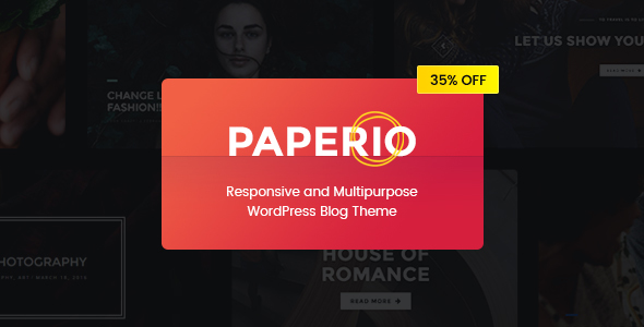
Blog / Magazine February 9, 2017February 9, 2017alexNo Comments Paperio – Responsive and Multipurpose WordPress Weblog Theme (Weblog / Journal) Live PreviewPurchase 39.00 Read More
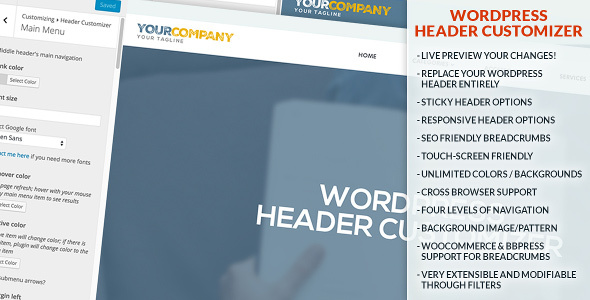
Utilities March 8, 2016March 8, 2016alexNo Comments WordPress Header Customizer (Utilities) Live PreviewPurchase 22.00 Read More