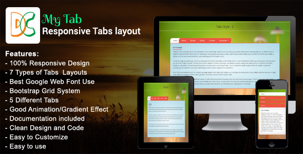
Social networking December 10, 2016December 10, 2016alexSocial networkingNo Comments My Tab – Responsive Bootstrap Tabs (Tabs and Sliders) Live PreviewPurchase 5.00 Read More
Social networking December 10, 2016December 10, 2016alexSocial networkingNo Comments My Tab – Responsive Bootstrap Tabs (Tabs and Sliders) Live PreviewPurchase 5.00 Read More
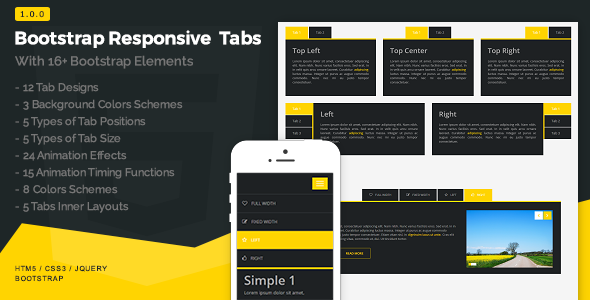
Social networking December 7, 2016December 7, 2016alexSocial networkingNo Comments Bootstrap Responsive Tabs (Sliders) Live PreviewPurchase 13.00 Read More