Category: Blog / Magazine

  • ReadPress – Journal WordPress Theme (Weblog / Journal)

    ReadPress – Journal WordPress Theme (Weblog / Journal)

    ReadPress – WordPress Magazine Theme

    ReadPress is a magazine WordPress theme. It is suitable for online magazine, news, or blog website. ReadPress is 100% responsive design and based on well-known CSS framework, Bootstrap.
    It is very easy to set up, the xml demo content is included in the theme package, and it is powered with Redux framework which offers an advanced theme options panel.

    If you like this theme, please don’t forget to rate it.

    ReadPress Features

    • 100% Responsive Design
    • Based on popular CSS framework, Bootstrap
    • HTML5 & CSS3
    • Social media share counter
    • Widgetized Homepage, allow you to build your own homepage
    • Powered with Redux framework, for advanced theme options panel
    • Featured image support
    • Dropdown menu support
    • Multiple header and menu styles
    • Unlimited colors
    • Google Font support
    • Breadcrumb NavXT, Contact Form 7, and Social Count Plus plugins support
    • Lot of useful custom widgets
    • Built-in related posts
    • Built-in author information
    • Built-in newsticker & search bar
    • Widget ready
    • Translation ready (.po/.mo files included)
    • XML demo content included
    • Easily add logo, favicon, custom css, etc…
    • Support & Updates
    • Documentation

    Changelog

  • Bamboo – Responsive WordPress Journal Theme (Wpblog / Journal)

    Bamboo – Responsive WordPress Journal Theme (Wpblog / Journal)


    Bamboo is a modern WordPress theme with clean, flexible and fully responsive design. It is ideal for the magazine, news and personal blog sites. The theme is highly configurable, you can completely configure the homepage and posts using the very easy and powerful theme options.

    Other features worth to mention

    1. Logo, favicon and apple touch icon uploader
    2. Semantic, clean, valid HTML5 & CSS3
    3. Multi Level Dropdown Menu
    4. Responsive Slider
    5. Widget-ready sidebar and footer
    6. Built-in image cropping
    7. Lightbox images
    8. Captcha Spam filter support for Contact Form
    9. SEO Optimised
    10. Built-in related posts
    11. Built-in social sharing
    12. Cross Browser Compatible
    13. Properly commented and formatted source code
    14. Extensive Documentation

    City News Responsive WordPress Theme


    Pacific Magazine Responsive WordPress Theme


  • Oslo (Blogging / Journal)

    Oslo (Blogging / Journal)

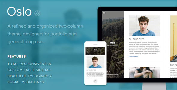
    Oslo is a stunning blend of refinement and organization. It’s a mature two-column theme fit for portfolio and general blog use, built around a supremely customizable sidebar and beautiful typography.

    Overview

    •    Oslo is an extremely customizable dual-channel theme for virtually any use.
    •    Oslo's sidebar is a perfect nexus, both easily brandable and intuitively organized.
    •    Ultra-modern typography and simple image controls round out Oslo's gorgeous face.
    •    Fully responsive on all devices.

    Features

    Responsive Layout
    Oslo is fully responsive and scales to fit any size device and browser.

    Two-Column Layout
    Oslo’s built with two beautiful columns to double your blog’s visual impact. On larger screens, your posts will be displayed side-by-side with metadata cleanly tucked away.

    Striking Sidebar
    Oslo’s masterfully organized and hugely cutomizable sidebar is invincible. Add as much or as little as info as you’d like, upload a background image, and adjust Oslo’s black overlay to create the perfect panel.

    Setup

    All of Oslo’s settings can be accessed using the Customize page for your site. Login to your site’s Dashboard and select Appearance > Customize from the left-hand menu.

    Now you can customize your site using the bar on the left-hand side of the screen. See below for more information on how to use these tools.

    Setup: Logo
    To set your logo, select Theme from the Customize page. Next, upload your logo image with the upload tool under the Logo heading.

    If you’d like to display the logo by itself, open the Site Title section and make sure that the Display Header Text box is unchecked.

    Setup: Link Colors
    To set the link colors, select Colors and use the Link Color and Active Link Color tools. The active link color will be used when you hover your mouse over a link.

    Setup: Sidebar Background
    To set the background color, select Colors and use the Header Top/Bottom Background Color tools. Having two background colors allows you to have a gradient background!

    To set a sidebar background image, select Header Image from the Customize page. Here you can add a new image, or select one from your media library. Note: the background image will be resized to fill the entire sidebar, so make sure it’s a large image!

    To make the sidebar background image semi-transparent, select Header Image from the Customize page, and use the Header Image Opacity selector.

    Setup: Sidebar Text
    To change the sidebar text colour, select Colors from the Customize page and use the Header Text Color tool. Note: this doesn’t change the menu text colour, which always stays white for better readability.

    To hide or show the site title and description, open the Site Title & Tagline section and use the Display Header Text box. You can also hide the theme credits here using the Display Credits box.

    Setup: Sidebar Menu
    The menu always has white text on a black background, but you can change how much of your sidebar background color/image shows through.
    To change the transparency of the menu background, select Theme from the Customize page, and use the Menu Background Opacity selector.
    If you have a sidebar background image, you can also choose to apply a blur effect when the menu is open. Select Header Image from the Customize page and use the Blur box. Note: if you do not have a background image set, this doesn’t do anything.

    Setup: Pages
    By default, your pages will show a Published date at the bottom. If you would like to remove this, select Theme from the Customize page and uncheck the Display Metadata on Pages box.

    Setup: Social Media Links
    Oslo gives you the option of adding social media links to the bottom of the sidebar.

    To add a link, select Theme from the Customize page. Here you will see quite a few text boxes where you can enter your links. For some social links, you can enter either a URL or your username. For example, if you’d like to add your Twitter profile, you would enter http://twitter.com/[your user name] or just [your user name].

    Currently, Oslo offers support for: Bandcamp, Behance, Delicious, deviantART, Digg, Dribbble, Etsy, Facebook, Flickr, Foursquare, Google+, Instagram, Last.fm, LinkedIn, E-Mail, Myspace, Pinboard, Pinterest, Rdio, Skype, Soundcloud, Spotify, StumbleUpon, Svpply, Twitter, Vimeo, and YouTube.

    Setup: Comments
    Oslo supports comments via the Jetpack Comments plugin on WordPress.com. Comments work out of the box, so you can start posting and holding discussions around your content immediately. WordPress does, however, give you options for managing how comments are displayed and when.

    To display comments on a per post basis, open up the post you’d like to enable or disable comments on by clicking Posts > All Posts in the left-hand sidebar in your Dashboard. Find the post you want to change, and click on it.
    Once you’re on the posts’s edit page, locate the tab toward the top right-hand side of the page labeled Screen Options. To display the options for toggling comments on/off, make sure the box next to Discussion is checked. This will reveal an additional box in the editor below labeled Discussion.

    To enable comments on a post, check the box next to Allow Comments in the Discussion box. You can do the same for pingbacks and trackbacks if you wish. To disable comments, just leave the box next to Allow Comments unchecked.

    If you’d like to control how your comments are displayed when they’re enabled, select Settings > Discussion in the left-hand sidebar in your Dashboard. From here, you’ll be able to control the specifics of how comments are displayed on the page. For more information about customizing comments, check out the WordPress.com comments documentation.

    Support

    We’ve been making themes since 2009. Truth to be told, we wouldn’t still be afloat had we not acknowledged, early on, that each individual customer is important. Exceptional, human customer support matters to us a great deal.

    Each one of our themes comes fully backed by our dedicated support team (all of us). We’re good people, with real faces, and we like what we do. We’ve also created a help centre so you can get help at any hour. Send us an email or tweet at us during office hours (we’re in PST!).

    We’re always happy to answer questions. Not sure what theme is best? Looking for a particular feature? Get in touch.

  • Block Journal – Flat and Minimalist Blogging Theme (Blogging / Journal)

    Block Journal – Flat and Minimalist Blogging Theme (Blogging / Journal)

    Block Magazine is fresh WordPress blog theme with masonry and fully responsive layout. Theme is suited for all blog, magazine or portfolio websites. Theme functions and features are based on solid back-end framework.

    Main theme features:

    • Advanced theme admin panel,
    • Grid (Masonry) homepage,
    • Blog template,
    • Extended custom menu – with popular posts,
    • Infinite scrolling,
    • Automatic Image desaturation*,
    • Retina ready,
    • Flex carousel,
    • 3 custom menus with dropdowns,
    • Responsive layout,
    • Unlimited color schemes – using colorpickers,
    • Font selector/custom typography – 57 fonts available (web-safe fonts and Google webfonts),
    • Multiple jQuery sliders (as blocks and in posts),
    • 7 Posts formats: standard, video, audio, gallery, image, link, quote, aside
    • Video ready – custom metaboxes,
    • Build-in rating system,
    • Dummy demo content,
    • Logo and favicon upload,
    • Social networks section,
    • Author template,
    • Translation ready,
    • WordPress 3.9 + ready,
    • Smooth tabless design.


    Layouts & Templates:

    • Homepage,
    • Full-Width template,
    • Redirect,
    • Error 404,
    • Blog template (index.php),
    • Archive templates,
    • Author template,
    • 3 post layouts (left, right and without sidebar),

    Plugin Compatibility:

    Blocks, Widgets & Shortcodes:

    • Advanced shordcode generator,
    • 9 custom widgets:
    • Featured widgets,
    • 300px Ads (custom widget),
    • 4×125px Ads (custom widget),
    • Latest comments (custom widget),
    • Flicker Photos (custom widget),
    • About Us Info (custom widget),
    • and more..

    * Image desaturation is not cross-browser compatible.

  • Erosion – Responsive Blogging WordPress Theme (Wpblog / Journal)

    Erosion – Responsive Blogging WordPress Theme (Wpblog / Journal)

    EROSION is powerful WordPress theme for blogging, magazine and company news portal with a lot of elements. You can create unique blog layout by using Visual Page Builder Premium Plugin Included.

    Features

    • Unlimited Colors
    • Bootstrap 3
    • Font Awesome 4
    • Box and Wide Layout
    • 3 Blog Layout
    • 7 Pre-Define Color
    • Flex Slider
    • Infinite Loading
    • 13 Widgets
    • Advertisement Ready
    • Shortcodes
    • Visual Page Builder
    • Advance Theme Options
    • Ready for translations
    • Sticky Header
    • Mobile Slide Menu

    Support

    If you have any question, please submit your ticket to email everislabs@gmail.com. We are very happy to listen and help you.

    Credits

    Those images are not included in the download, they were just for demo purposes.

  • Skyting Journal WordPress theme (Weblog / Journal)

    Skyting Journal WordPress theme (Weblog / Journal)

    Skyting is a straightforward and feature-rich magazine WordPress theme. Skyting has been built by using some of the most popular current design trends as HTML5, CSS 3, jQuery. Fully responsive, it has really great look and is very attractive on any device.

    With its professional layout, it’s easy to customize. Skyting can be set up quickly and easily, whether you’re an experienced developer or occasional blogger. It provides everything you’ll need to create a professional looking website. This magazine WordPress theme was designed and coded by KOPATHEME

    Features

    • Fully Responsive
    • Unlimited colors options with color picker in backend
    • Built with Boostrap and retina ready
    • HTML5 and CSS3 tableless design.
    • Custom fonts with 600+ Google fonts
    • Visual shortcode generator
    • Unlimited sidebar.
    • A lot of widget elements
    • Easily adding Google analytics, logo, favicon, social links …
    • Works in all major browsers: Internet Explorer (IE 8+), Firefox, Opera, Safari, Google Chrome
    • Theme Update Notifier.
    • Localization Support
    • Documentation included

    Support

    • Support through our support forum at http://kopatheme.com/forum for general questions.
    • Support via support ticket http://kopatheme.com/submit-ticket/
    • We are available for customize the theme if you need. Please send us your email at kopatheme@gmail.com
      In working day (from Monday to Friday), all the question or problem related to our product will be responded within maximum 24 hours. No matter how long it takes, we will support you until the problem is completely fixed. Support request sent during weekends will be processed on next Monday morning.
  • Sq. – Responsive Multi-Goal Theme (Blogging / Journal)

    Sq. – Responsive Multi-Goal Theme (Blogging / Journal)

    RSS
    Follow on ThemeForest
    Follow on Twitter
    Support Forum

    Square – A Multi-Purpose Fully Responsive WordPress Theme by Parks & Parker.

    Square is an endless, responsive, highly customizable theme which supports a wide variety of content. Change everything to your own taste and post whatever you want. It’s up to you!

    Fully Responsive

    Square is fully responsive and will look perfect regardless of whether you’re using a huge desktop or a small phone. Desktops, iPads, iPhones, Android phones, doesn’t matter. Square will look great.

    Multiple Post Formats

    Square supports the following post formats: Standard, Quote, Link, Gallery, Video and Audio. We have developed our own plugin that will allow you to easily add content to these posts.

    Square in a nutshell

    • Ultra-clean Design
    • Fully Responsive
    • Valid HTML5 and CSS3
    • Easily Customizable
    • Widgetized Sidebar
    • Multiple Post Formats

    Theme Support

    If you need any help please visit the support forum: http://parksandparker.com/support/

  • Novelty Journal WordPress theme (Weblog / Journal)

    Novelty Journal WordPress theme (Weblog / Journal)

    Novelty is a straightforward and feature-rich magazine WordPress theme. Novelty has been built by using some of the most popular current design trends as HTML5, CSS 3, jQuery. Fully responsive, it has really great look and is very attractive on any device.

    With its professional layout, it’s easy to customize. Novelty can be set up quickly and easily, whether you’re an experienced developer or occasional blogger. It provides everything you’ll need to create a professional looking website. This magazine WordPress theme was designed and coded by KOPATHEME

    Features

    • Fully Responsive
    • Unlimited colors options with color picker in backend
    • Built with Boostrap and retina ready
    • HTML5 and CSS3 tableless design.
    • Custom fonts with 600+ Google fonts
    • Visual shortcode generator
    • Unlimited sidebar.
    • A lot of widget elements
    • Easily adding Google analytics, logo, favicon, social links …
    • Works in all major browsers: Internet Explorer (IE 8+), Firefox, Opera, Safari, Google Chrome
    • Theme Update Notifier.
    • Localization Support
    • Documentation included

    Support

    • Support through our support forum at http://kopatheme.com/forum for general questions.
    • Support via support ticket http://kopatheme.com/submit-ticket/
    • We are available for customize the theme if you need. Please send us your email at kopatheme@gmail.com
      In working day (from Monday to Friday), all the question or problem related to our product will be responded within maximum 24 hours. No matter how long it takes, we will support you until the problem is completely fixed. Support request sent during weekends will be processed on next Monday morning.
  • Center of attention Information & Journal WP Theme  (Wpblog / Journal)

    Center of attention Information & Journal WP Theme (Wpblog / Journal)

    Focus Responsive WordPress Theme is really creative, feeling very gentle and delicate are what This WordPress template will bring to your Magazine sites, Blogs Site, news site It is specially designedthat will work great for travel agencies, travel and city guides, review website. And This is first theme built in our Wordpres Framework Theme With Bootstrap 3 that to make fully responsive theme that works perfect on all kind of resolutions as well for mobile, tablet, desktop having medium and large screen.

    With powered by the framework the theme support you many great tools to customize theme via using Live Theme Editor, Auto loading custom css files support you creating unlimited of theme profiles without code very easy and simple and a lot of great features you will love.

    Highlighted Features


    Explore Features Via Guides

    Read Guide Now

    Features

    • Compatible with WordPress 3.9
    • Support Wide Screen 1170px, 980px
    • Built-in WPO Framework Version 1 and Bootstrap 3.0
    • UNLIMITED predefined color schemes: red, orange, blue and green
    • HTML5 and CSS3 Support
    • Full Responsive Theme
    • Google Fonts
    • [NEW] Integrated Mega Menu Module With Lightweight Megamenu Editor Tool
    • Support multiple post types: blog, porfilios, video, news, slideshow
    • Included a lot of widgets in this
    • Valid XHTML and CSS markup
    • Eeasy control theme such as skin changer, font-changer, modules – position via Control Panel Module
    • Easy Use and Easy Customize As great for customwork
    • Support Add Custom Javascript, Css, Change Background
    • [NEW]Impletemented Awesome Font
    • [New] Support Less Development
    • [New] Live Theme Edtior to create unlimited Theme Skins Without Coding
    • Easy to customize typography (font family, font size, line height, font style and color) for body text and all headings. Support Google fonts and standard fonts.
    • [New] Support Adding Custom Css and JS Code In Theme Control Module
    • [New] Support Css Compression to improve Site performence
    • [New] Easy install datasample, theme, modules on existed Site

    Support Ways