Month: June 2014

  • Karo – Journal WordPress theme (Blogging / Journal)

    Karo – Journal WordPress theme (Blogging / Journal)

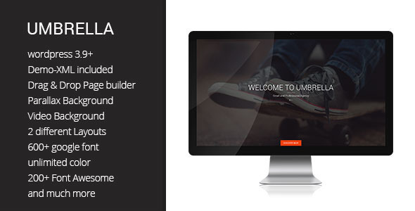
    Karo is a stylish magazine WordPress theme which has really great look and is perfect for your magazine, blog or news websites. Karo has been built by using some of the most popular current design trends. It encompasses some of the best open source technologies such as HTML5, CSS3 and jQuery and supports a multi-layout setup. This theme makes it easy for you to change and tweak the design to make it your own with accommodating features including an updated Logo and Favicon can, fonts Google and Color, putting you in control of the look and feel of your website in moments.

    This stylish magazine WordPress theme was designed and coded by KOPATHEME
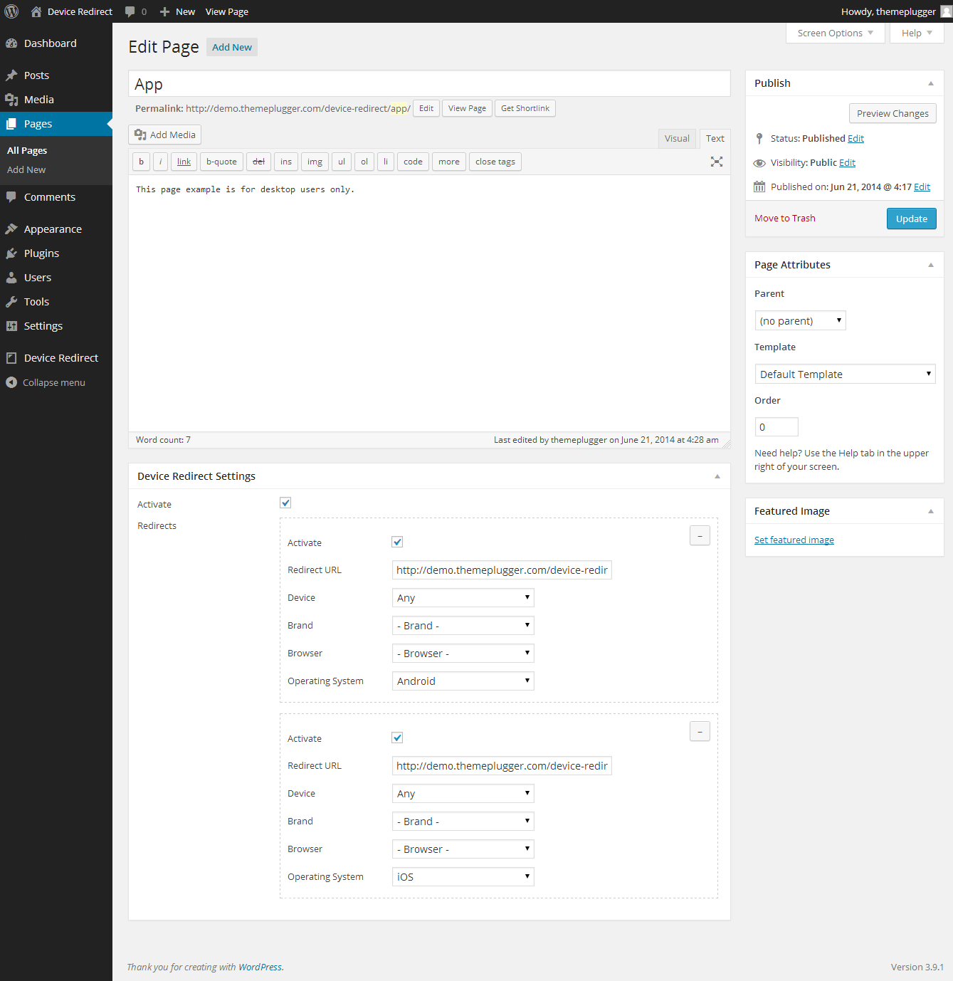
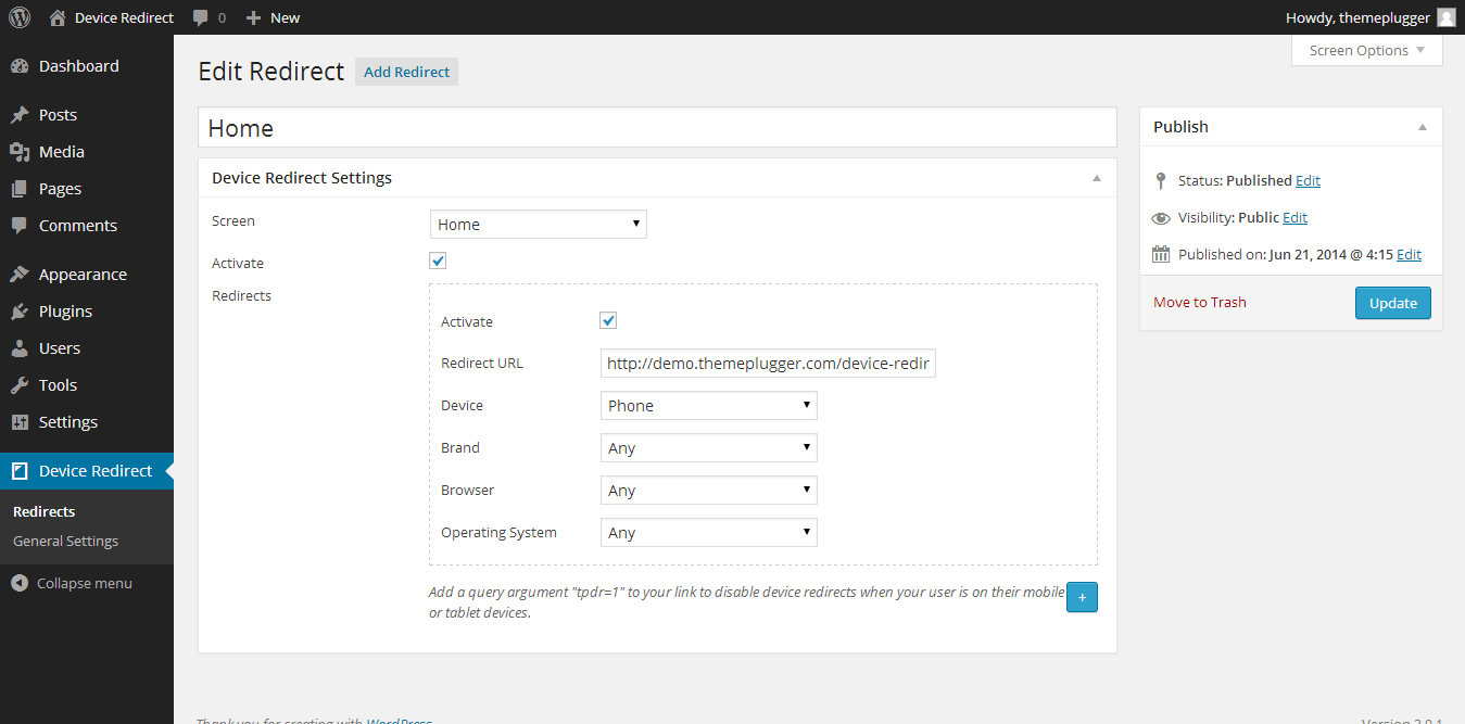
    Features

    • Responsive Design:

      Integration of responsive design elements is an intelligent design theme identify target adjusts itself to any screen size in order to achieve the desired result that Karo Magazine WordPress Theme can be works flawlessly on all screen types from the smallest Smartphone screen to the larger computer monitor.
    • Multiple Layout Options:

      The theme supports a multi-layout schematic allowing you to choose from a list of different layouts for possible page display options and customize with more than one page as per your requirement. So, you will feel flexible and easy control them. This theme comes with a number of page layouts to choose from and supports multiple post formats (Standard, Video, Audio and Gallery).
    • Unlimited sidebar:

      In Karo theme, you are completely free in terms of quantity and content of the sidebars. It allows you to specify a custom sidebar on any page you want by drag-and-drop the desired widgets simplest of equipment on it. So, add different widgets into the sidebar to enhance the diversity and functionality of the site.
    • An excellent add-on feature we have included with the theme is the Homepage Featured slider. It can be used to highlight the most important posts on your website. Additionally, you could also highlight the latest or the most viewed posts as per your preference. Post titles and excerpts are also included in the posts slider. All you need to do is to select the posts you want to highlight and they appear on the slider.
    • Cross browser compatibility:

      The theme works flawlessly on all major browsers such as Internet Explorer (IE8 or greater), Firefox, Chrome, Safari and Opera.
    • Custom shortcodes:

      A number of custom shortcodes creating options have been integrated in to the theme. Just click the appropriate icon to create buttons, columns, tabs, accordions, toggles, video, vimeo,… all in an instant.
    • Child theme compatible:

      A child theme is a theme that inherits the templates and functionality of parent theme. So it allows you to modify, or make change without modifying the parent theme.
    • A selection of custom widgets

      The Karo comes loaded with a selection of feature-rich widgets.
    • Translation Ready

      Language Localization Support .po/.mo files are included with the theme. Additionally, the theme is WPML compatible which means you can translate into other languages you want.
    • Woocommerce itegrated

      You can use the theme for your online shop

    Support

  • Zero – Responsive WordPress Template with Retailer (Company)

    Zero – Responsive WordPress Template with Retailer (Company)

    Zero wordpress template is a multifunctional, creative wordpress template with integrated WooCommerce. The professional design of the template allows it to be whatever you need, so it is multifunctional in every way. With advanced page building with drag & drop editing it has never been easier to modify or create the content.

    WordPress 3.9 Ready

    D-light - One Page Creative WordPress TemplateAnivia - News, Magazine, Blog WordPress TemplateDivision - Multipurpose WordPress TemplatePortal - Creative Portfolio WordPress Template

    Support

    Rate us

    Credits

    All images used in the preview are only for demo purposes and not included with the theme package. All the images are copyrighted and licensed to their respective authors and owners.

  • PrettyLoader – Flat Web page Preloader for WordPress (Media)

    PrettyLoader – Flat Web page Preloader for WordPress (Media)

    PrettyLoader – your visitors will fall in love with your fresh WordPress site from the first sight.

    PrettyLoader is the Best Preloader for WordPress.

    PrettyLoader for WordPress is the page preloader and spinner solution that will make you and your visitors proud of your website. PrettyLoader page preloader features over 15 image-based content preloader spinners, as well as 8 CSS-based spinners (completely image-free). But that’s not all! There are 5 predefined full-sized smooth page transitions, supporting all major browsers and mobile devices (tested on iOS and Android). There is no programming knowledge required.

    PrettyLoader was built with modern design techniques in mind. You can choose between “normal” and flat spinners, choose a background color or apply some fancy background image of your choice (background images are not included). We’ve even built a completely unique type of backgrounds – tricolor backgrounds! You simply specify 3 colors of your choice and PrettyLoader does all the magic for you. Check out the demo site number 2 to view tricolor backgrounds in action.

    PrettyLoader Features

    Page Preloader

    The all-in-one solution for WordPress. Let your visitors expirience fancy loading animations and nice full-page transition effects.

        
    Full-Page Transitions

    We’ve built 5 full-page transition inside PrettyLoader for WordPress. From gentle fade effect to more complex “geenie’s”.

     
    Spinner Graphics

    Over 15 graphical spinners are included in PrettyLoader. And these are not GIF animations, but transparent PNG’s. This means you are not bound to use the simple white background.

        
    Pure CSS Spinners

    Want to keep the loading speed even faster and use latest technology? There are 8 CSS-based spinners waiting for you to choose from. Set their size, set their color and they are ready for action.

     
    Unique Tricolor Backgrounds

    Find single-colored or image backgrounds boring? We are exciting to present you our unique tricolor background technology!

    Background Colors and Images

    Choose a background color of your choice, or upload a background image (full-sized or tiled). You can even add a border to fine-tune your design.

     
    Easy Installation

    The installation process doesn’t require more than 3 clicks within your WordPress dashboard, though we’ve included an extra documentation ;)

    Customizable

    There are lots of customisation options waiting for you after the plugin has been installed. It’s very easy to understand. No programming knowledge required.

     
    Responsive Design

    We’ve spent lots of hours testing PrettyLoader on several devices (Windows, Mac, iOS and Android) to make sure everything runs smooth.

    Object-Oriented Programming

    It is pretty easy to extend this plugin if you’d like to. The code is easy-to-read and fully commented.

     
    Free Updates

    We offer plugin updates free of charge. Stay up to date with our PrettyLoader and receive latest releases and enhancements.

    Professional Support

    We are always there to help you out whenever you require any assistance or faced difficulties. If you’ve got a cool idea – let us know and it may see the light in the upcoming updates!


    UPDATES

    24.06.2014 - ver 1.0
       - PrettyLoader release
    

    Special Thanks

  • Newgen – Responsive Information/Journal WordPress Theme (Wpblog / Journal)

    Newgen – Responsive Information/Journal WordPress Theme (Wpblog / Journal)

    NewGen is a Responsive WordPress News/Magazine Theme.

    Features

    • Page Builder
    • Mega Menu
    • Review System
    • Custom Sidebars compatible!
    • Woocommerce Shop compatible!
    • Events list!
    • Fully responsive
    • Unlimited theme colors
    • 9 Page Templates
    • 4 Post formats: post, image, video, audio
    • 80+ Theme Options
    • 8 Custom Widgets:
      • Banners
      • Popular posts
      • Recent posts
      • Recent category posts
      • Recent category posts – second variant
      • Video Widget
      • Carousel posts
      • Flickr Photos
    • 3 Widget Areas + Menu
    • Twitter Stream
    • Flickr Photostream
    • Theme Options:
      • Custom Logo Upload
      • Custom Favicon Upload
      • Featured settings
      • Cufon Fonts
      • Social widget
      • Typography
      • Localization
      • Colors
      • SEO
    • WordPress 3.9+ Ready!
    • 2 Custom Menu
    • Post Thumbnails without timthumb
    • Page Templates:
      • Home page
      • Home page with Carousel
      • Home page with 3d Slider
      • Home page with Revolution slider
      • Home page with Video slider
      • Page full width
      • Sitemap
      • Error 404
      • Contact
    • Custom blog posts
    • Custom portfolio
    • SEO
    • Extensive Documentation
    • Support 24h
    • Crossbrowser compatible

    Theme Options

    • General settings
    • Featured
    • Pages
    • Single post
    • Single page
    • Colorization
    • SEO
    • Translation
  • Fontana – Highly effective Media WordPress Theme (Wpblog / Journal)

    Fontana – Highly effective Media WordPress Theme (Wpblog / Journal)

    Get supportLike us on FacebookFollow us on Twitter

    Fontana is ultra responsive, retina ready, and built on Twitter Bootstrap framework. It features a clean, modern and interesting design, packed with the super powerful TouchSize Layout Builder which offers unlimited possibilities and options. Our Page Builder is at the core of our theme, giving you full control over your website and lets you create sites that suits your needs. The builder incorporates some incredible features making it one of the most versatile themes on the market . If you’re looking for a theme that will offer you the possibility to create any website – Fontana is the one.

    Fontana iMac

    Fontana iPhone iPad

    Fontana Macbook

    Fontana is responsive

    It just looks good on any device, from big desktop monitors to small smartphone screens.

    Fontana is respects your content

    You don’t get any hidden content for mobile devices. No sidebars and content blocks are hidden.

    Fontana includes TouchSize Layout Builder

    UNLIMITED layouts. Enough said. Our builder gives you the opportunity to change anything. It includes lots of elements that you can arrange to suit your needs. As the website uses the 12 columns Twitter Bootstrap setup, it’s easy to manage your content through columns. Any element can have from 2 to 12 columns. 5 styles of listing posts, with tons of options for each type. And the important thing – IT’S EASY. It’s not an additional plugin – it stands at this theme’s core and it works blazingly fast! Everything is well made and documented.

    Fontana is high-resolution (retina) ready

    This theme is retina-ready. No additional coding and plugins are required.

    Fontana is by an Elite Author

    People like what we do. We craft themes and plugins to help them and keep them updated with latest technologies. We proved that our work is good, and you, the customers felt what it feels to have a good product.

    Fontana has Powerful Meta Options.

    Our meta options integration provides the flexibility to control the layout of each page/post, setting sidebars, thumbnails, links, and more.

    Fontana has Google fonts integrated.

    This theme includes font customization. Choose the font you like and suits your needs.

    Fontana has UNLIMITED HEADERS.

    Not 2, 3, 4, 5. UNLIMITED layouts. Headers are created through the layout builder and can be adjusted as you need. No limitations.

    Fontana has UNLIMITED FOOTERS.

    Just like the header – you have unlimited layouts. No restrictions, change the footer as you think it will look better. Your website, your rules.

    Fontana has Localization.

    Localization Theme comes with .po and .mo files which will make it easy to translate the theme to your language.

    Fontana has Demo content included.

    Demo content comes with the package. Just download the theme and you’ll get all the demo content included.

    Fontana has Unlimited sidebars.

    You can add as many as you need. Include them in the layout builder. Make them bigger or smaller in width. Use them anywhere you want.

    Fontana has Custom widgets.

    Widgets make your life easier. We included some social widgets to connect with your customers. Because social media is important.

    Fontana has 5 custom posts.

    It’s easier to manage each post type. That’s why we have Portfolios, Sliders, Feature blocks, Team members, Testimonials added as standard.

    Fontana has 2 built-in sliders.

    We have Flexslider and Slicebox integrated, and still the theme is compatible with any slider that can run through shortcodes like Revolution Slider, Layer Slider, etc.

    Fontana has Custom theme options panel.

    Not only it has a Layout Builder included, this theme has tons of options as standard accesible through the Theme Options page.

    Fontana has exclusive 5* support.

    Because you mean a lot to us. Because our customers receive the best support. And because we love to see our products shining and looking great. Everything is organized and simple. Once you need it – you can check our knowledgebase and the ticketing system where we will be happy to answer any questions and assist with anything you need. It’s easier for everybody to write questions and receive answers. Fast and simple!

  • Sun – Responsive Blogging Theme (Wpblog / Journal)

    Sun – Responsive Blogging Theme (Wpblog / Journal)

    Great and Modern looking responsive WordPress Blog Theme.

    Features

    Responsive Layout

    Amazing Support

    Translation Ready

    Sidebar Manager

    Detailed PSD Files Included

    What people say about Themes Kingdom

    Micha Karmann
    Guys … you’re FANTASTIC! AWESOME!!! THIS is what I call support. One of the best here at ThemeForest. Maybe the best. THANX!!!

    Nicole Allison
    The experience I’ve had with Themes Kingdom has been wonderful. The customer support it exceptional and the amount of attention to detail and care that goes into the templates is wonderful. I would highly recommend Themes Kingdom to any developer or anyone looking to create a spectacular site on the WordPress platform.

    Ryan Burns
    Love the Themes Kingdom support. Always take care of their customers. Great premium WordPress themes

    Anya Piper
    Uberly impressed with the AMAZING support I constantly get from Themes Kingdom < awesome!!!

    Support

    Support for all Themes Kingdom themes is handled through the Themes Kingdom support system, if you’d like to open a new ticket over there and Themes Kingdom support team will take a look at your issue :)

    How to register support account?

  • Umbrella – One Web page WordPress theme (Ingenious)

    Umbrella – One Web page WordPress theme (Ingenious)

    Description

    Umbrella – is clean one page parallax responsive and retina ready WordPress theme. It is great, professional and easy to use theme. You can use it for Photo Studio, Freelancers, Portfolio Theme, Creative Agency etc.

    Our theme include all features that you need

    • Drag & Drop Page builder
    • Unlimited Colors
    • video backgrounds
    • parallax sections
    • headers versions
    • responsive and retina ready
    • single projects
    • single blog
    • Working Contact Form
    • Font Awesome
    • Retina Ready
    • Css3 Animations
    • Google map
    • Easy Customizable
    • Well documented

    By purchasing our theme you receive a professional 24/7 support. Our team will gladly respond to your conncerns as soon as possible, and help you out if you need a customization.

  • Tool Redirect – WordPress Cellphone &Pill Redirect (Utilities)

    Tool Redirect – WordPress Cellphone &Pill Redirect (Utilities)

    What is Device Redirect?

    Device Redirect is a plugin that redirects users to your specified optimized page URL according to their devices they are using — phone or tablet. It offers a more in depth filter parameters to target users according to their device brand, browser, and device operating system. Currently works on homepage, post, page, and custom post types in WordPress.

    Redirect Rules

    • Sitewide – Redirect every page to a specific URL you provide with the parameters you choose — device, device brand, browser, and device operating system. (This feature can be located at the left side panel under “Device Redirect > Redirects”)
    • Global – Redirect your users according to screen and screen type (homepage, single, single post, singe page, or a custom single post type). This setting acts as global redirect rules if no specific post redirect rules is set.(This feature can be located at the left side panel under “Device Redirect > Redirects”)
    • Local – Redirect your users according to specific post, page, or custom post. (This feature can be located below post content of every admin edit post. This feature must enabled at “Device Redirect > General Settings”)

    Example #1: Homepage

    Visiting this link with Device Redirect plugin enabled and with redirect rules set up would redirect your users accordingly to the redirect rules or parameters you setup for this page.
    http://demo.themeplugger.com/device-redirect/

    If you visit the link above in your phone or tablet, you’ll be redirected to the following pages according to what redirect rules you are matched.

    (Any phones)
    http://demo.themeplugger.com/device-redirect/home-mobile/

    (Any tablets)
    http://demo.themeplugger.com/device-redirect/home-tablet/

    To override Device Redirect plugin from redirecting you, add a query argument to the link “tpdr=1”.
    http://demo.themeplugger.com/device-redirect/?tpdr=1

    Example #2: Page

    Visiting this link with Device Redirect plugin enabled and with redirect rules set up would redirect your users accordingly to the redirect rules or parameters you setup for this page.
    http://demo.themeplugger.com/device-redirect/app/

    If you visit the link above in an Android or iOS powered devices, you’ll be redirected to the following pages according to what redirect rules you are matched.

    (Any devices that is Android)
    http://demo.themeplugger.com/device-redirect/app/android/

    (Any devices that is iOS)
    http://demo.themeplugger.com/device-redirect/app/ios/

    To override Device Redirect plugin from redirecting you, add a query argument to the link “tpdr=1”.
    http://demo.themeplugger.com/device-redirect/app/?tpdr=1

    Friendly UI


    Credits

    Changelog

    Version 1.0 on June 21, 2014
     - Initial Release
    
  • WordPress Responsive Simulator (Utilities)

    WordPress Responsive Simulator (Utilities)


    Test our plugin out using the Live Preview above and the credentials below.

    Username: demo

    Password: password

    WP Responsive Simulator gives you a great way to demo your products and mockups online in a fully responsive way. Let your client view your design and see how it reacts to different device sizes with the click of a button. Secure your demo links using WordPress’s online permalinks so your demo directory is never visible to the end user.

    Preset with common screen resolutions from mobile to large format, but you can also give them a way to add new resolutions to their preview. Your user can simply drag the resolutions around or add their own.

    Need additional protection? Add another layer of security by using WordPress’s built in password protected page feature and allow only users with access the ability to see your work.

    FULLY RESPONSIVE AND THEN SOME

    Set with pre-configured resolutions such as phone, iPhone 5, tablet, netbook, and large format with the added bonus of full customization to allow your clients to add new resolutions as they see fit.

    PASSWORD PROTECTED

    Need a demo or mockup to be password protected? Well, now you have one. Set your password and send the client a link. When they type the password, the simulator is visible, otherwise they get an log on message.

    PLUGIN FEATURES

    • Create responsive links to your demos or mockups
    • Password protect your links
    • Enter a single URL, that is it…everything else is handled by the plugin

    Have an idea that we can implement? Share it with us in the comments or message us on Code Canyon and your idea may get put into our next revision.

    WordPress Responsive Simulator

    Change Log

    Current Version: Version 1.0

    • Version 1.0
      • WordPress Online Contract is offical. Enjoy