

Introduction
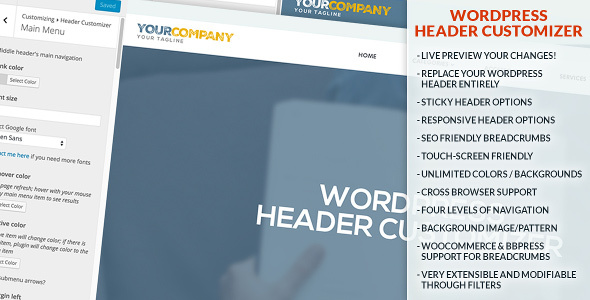
Header Customizer is a WordPress plugin developed by vmux which enables you to modify your header by live previewing it at the same time.
Only after you are happy with your settings, you can save and publish it safely.
This Documentation is intended to help you configure and get the most of your Header Customizer.
Header Customizer is a premium WordPress plugin which can replace your WordPress header entirely, is responsive and also has a sticky feature. It enables you to have up to four layers of navigation in your header.
It’s purpose is to make your website more useful, user friendly and to improve the general look and feel, even on phones and tablets.
You can modify your header visually using WordPress Customizer API,
which enables you to make changes to the header while looking at your website at the same time.
Installing Header Customizer
This plugin requires minimum WordPress version 3.4.
You can install Header Customizer via FTP (or copy it by any other techniques) in the following manner:
- Download the plugin from and extract the contents
- Copy the awesome-header folder to the /wp-content/plugins/ directory
- Activate the plugin through the Plugins page in WordPress dashboard
- Put following code inside your content:
<?php echo apply_filters('hc_print_header', ''); ?>
- Most of the time it would be in your header.php file, right after opening
<body>tag
Next, using WordPress Customization you can start customizing! Simply inside admin area go to Appearance -> Customize. There choose Header Customizer pane to use this plugin’s features. I prepared you nice gif so you don’t feel confused:

Insert Header Into Your Theme
Simply insert following code right below <body> tag:
<?php echo apply_filters('hc_print_header', ''); ?>
And that is it. You’ll be able to see changes while modifying your header through Header Customizer!
General Settings
Header Customizer can replace your theme’s header and it can appear once a user scrolls down and your theme’s header disappears from sight (sticky option).
This panel contains following settings:
- Header width – width of the header content
- Stretch header width? – should header wrapper stretch the whole width of a browser?
- Header left position – if your header is sticky, you should use this option if you don’t want header to be horizontally on the center
- Margin top
- Margin bottom
- Margin left
- Margin right
- Google Font – choose font for the header; there are more specific options for fonts (e.g. only for logo area) but this is for the whole header at once
- Custom CSS – you can type any CSS here; make sure to start your CSS definitions with ”.hc-wrap ” so you don’t mess with other website’s CSS definitions
Here you can see some playing around inside General Settings (click on this image to see it fully enlarged):

Middle Header
Middle Header is section of Header Customizer which contains logo area (logo & description) and main menu (with submenus). You can customize following:
- Header type – how are your logo and menus placed; by default logo goes on the left side, while main menu goes to the right side of the header; you can set them both centrally aligned, or move menu to the left next to the logo
- Background color – background color of middle header, solid color with transparency set optionally through color picker
- Background image – background image of middle header (overrides background color)
- Background image repeat – background image of middle header (overrides background color)
- Background image attachment – the background-attachment property sets whether a background image is fixed or scrolls with the rest of the page; it’s great to set parallax effect for example if set to “fixed”
- Background image position – the background-position property sets the starting position of a background image
- Background image size – the background-size property specifies the size of the background images
- Padding (top/bottom) – padding of middle header so you can fit vertically your menu or logo nicely
- Padding (left/right) – padding of middle header so you can set the distance of inner content from left or right side of the screen
- Border top (and bottom, left, right) color – not visible until border width is set to at least 1 (one) pixel (px)
- Border top (and bottom, left, right) width – width of the border
- Top left (and bottom left, top right, bottom right) radius – border radius of the middle header
Here you can see some playing around with backgrounds inside Middle Header (click on images to see them fully enlarged):


Here you can see some playing around border radius of the Middle Header so it looks rounded>

Top Header
Top Header is another important section of Header Customizer. It contains (same as bottom header) left and right side, which goes centrally aligned when responsive mode is turned on (when your screen size is small, i.e. size set in Responsive Header panel). You can choose for both sides to have either: some other menu, breadcrumbs, current page title or search box. Following are settings that you can modify:
- Enabled? – is the Top Header enabled at all? (checkbox)
- Left menu side type – choose between menu, breadcrumbs, current page title or search box for the left side of Top Header
- Right menu side type – choose between menu, breadcrumbs, current page title or search box for the right side of Top Header
- Background color – same here as for Middle Header
- Background image – same here as for Middle Header
- Background image repeat – same here as for Middle Header
- Background image attachment – same here as for Middle Header
- Background image position – same here as for Middle Header
- Background image size – same here as for Middle Header
- Google font family – choose font family only for this (top) header; you may contact me if you need more fonts added
- Font size – choose font size only for this (top) header
- Border top (and bottom, left, right) color – same here as for Middle Header
- Border top (and bottom, left, right) width – same here as for Middle Header
- Padding (top/bottom) – same here as for Middle Header
- Padding (left/right) – same here as for Middle Header
- Link margin (left/right) – margins between links (for example menu items)
- Link padding – paddings (top, bottom, left, right) of all links
- Menu item padding (left/right) – left and right paddings of menu items only (if menu is set to one of left or right sides); applicable to LI (list) tags of menu
- Menu item padding (top/bottom) – top and bottom paddings of menu items only (same applies here)
- Link color (and hover color, background color, hover background color) – colors of links
- Text color – color of texts (“non-links”, i.e. breadcrumb’s last piece or page title)
- Link border color – all four (top, bottom, left, right) borders color; not visible until border width is set to at least 1 (one) px (pixel)
- Link border width – all four (top, bottom, left, right) borders width for links
- Link border radius – all four (top, bottom, left, right) borders radius for links
- Top left (and bottom left, top right, bottom right) radius – same here as for Middle Header
Bottom Header
Bottom Header is another important section of Header Customizer. It contains (same as bottom header) left and right side, which goes centrally aligned when responsive mode is turned on (when your screen size is small, i.e. size set in Responsive Header panel). You can choose for both sides to have either: some other menu, breadcrumbs, current page title or search box. Following are settings that you can modify:
- Enabled? – is the Bottom Header enabled at all? (checkbox)
- Left menu side type – same here as for Top Header
- Right menu side type – same here as for Bottom Header
- Background color – same here as for Middle Header
- Background image – same here as for Middle Header
- Background image repeat – same here as for Middle Header
- Background image attachment – same here as for Middle Header
- Background image position – same here as for Middle Header
- Background image size – same here as for Middle Header
- Google font family – same here as for Top Header
- Font size – same here as for Top Header
- Border top (and bottom, left, right) color – same here as for Middle Header
- Border top (and bottom, left, right) width – same here as for Middle Header
- Padding (top/bottom) – same here as for Middle Header (exists only if you’re currently not on front page)
- Padding (top/bottom) on front page – this is same as above except it’s only when you’re on home page! When you’re on page other than home or front (depends on your WordPress settings) then this option won’t exist
- Padding (left/right) – same here as for Middle Header
- Text color – same here as for Top Header
- Link color (and hover color) – same here as for Top Header
- Margins for menu items (left/right) – if menu is selected to be on left or right side, this will be their left and right margins
- Top left (and bottom left, top right, bottom right) radius – same here as for Middle Header
Logo Area
Logo area is part of your header which contains logo (as text or image link) and site description. Following are the settings you can modify:
- Logo image – image as your logo
- Logo type – set type of your logo: link image or link text
- Logo text – site title by default
- Maximum width – it’s useful not to stretch when header goes responsive
- Padding (top/bottom) – top and bottom paddings; play around to set it vertically nicely against main menu
- Google font family – for textual logo only
- Google font family for description – for description only
- Show logo area? – yes or no (checkbox); if you need to remove logo area completely
- Show logo? – yes or no (checkbox); if you need to remove logo only
- Show logo description? – yes or no (checkbox); if you need to remove description (tagline) only
- Site title color (and hover color) – if your logo is textual, set it’s color here
- Site description color – color of logo description (tagline)
- Site title font size – font size for textual logo
- Site description font size – font size for description (tagline)
Main Menu
Main menu is part of header which is placed inside Middle Header alongside with logo area. It’s submenus are placed within Main Submenus section. Following are the settings you can modify:
- Link color (and hover color, active color) – these options are only for link (<a> tags) colors; active color is color of a link when on current page
- Font size – font size of menu items
- Google font family – font family of menu items
- Show submenu arrows? – checkbox; show arrow pointing down for menu items which have submenus
- Menu margin left (and right) – margin left and right of the whole menu (not menu items!)
- Link background color (and hover and active background colors) – only for links
- Link border radius – only for links, so they can be “rounded”
- Menu item background colors (and hover, active background colors) – for list items (<li> tags!)
- Menu items padding (top/bottom) – list tag paddings, so you can align with logo area nicely
- Menu items padding (left/right)
- Menu items margin (top/bottom)
- Menu items margin (left/right)
- Menu links padding (top/bottom) – for links (<a> tags)
- Menu links padding (left/right) – same
- Menu item border top (and bottom, left, right) color – border colors for list items
- Menu item border top (and bottom, left, right) width – border width
- Menu item top-left (and top-right, bottom-left, bottom-right) radius – each of these options have possibility to exclude all other items except first or last item, so the whole menu looks “rounded” (take a look at the gif example below!)
To setup main menu, first you need to set any menu you have saved before to be placed to “HC Main Menu” location. Take a look at the following example:

Here’s how you can modify link colors for example:

Main Submenus
Submenus appear on hover or click on main menu items. There are up to four levels of submenus to choose how deep submenus will go. Many more options are here, so let’s list them below:
- Submenus depth – like stated previously, you can choose how many levels of submenus you’ve got
- Show submenu on mouse hover? – whether to click or hover main menu items or submenu items in order to show submenus; responsive header will always react on tap (click)
- Background color – background color of all submenus
- Min. width – minimum width that your submenus take; by default it’s set to auto
- Font size – font size of all submenu items
- Border color – border color of all four sides of one submenu column: top, bottom, left, right
- Border top (and bottom, left, right) width – four separate options for borders’ width
- Menu items border top (and bottom) color – border color of submenu links (except first one, or last one if it’s bottom color)
- Menu items border top (and bottom) width – border width of submenu links (except first one, or last one if it’s bottom width)
- Shadow – shadow set using CSS property box-shadow; it’s set in text field using full definition, e.g. 2px 2px 2px 2px rgba(85, 85, 85, 0.8) and when you make changes to any of the values you can see them live as you type
Breadcrumbs
Breadcrumbs are great for improving your website’s visibility on Search Engines and SEO. Header Customizer’s breadcrumbs implement data-vocabulary.org definition.
- Font size – font size of breadcrumbs only
- Google font family – font family for breadcrumbs only
- Show home page link? – whether breadcrumbs show link to home page; by default it does
- Separator text – separator character(s) which sit in between page links
- Separator color – color of separator text
- Separator margins (left/right) – separator margins
Note: Breadcrumbs are placed in Top or Bottom header, but first you need to activate any of them and place Breadcrumbs as left or right side menu, like so:

Page Title
Page title is very suitable to be placed on bottom part of the header. It shows page name of the current page. You can modify the following:
- Color – color of page title
- Show on home page? – whether to show title for home page
- Margin top/bottom
- Font size – font size of page title only
- Font family – font family of page title only
Note: To have page title you must select it as left or right side menu in Top or Bottom headers.
Search Box
Search box should be integral part of your header if you would like to have it there instead of, for example, on sidebar. You can change many settings here:
- Color – text color only; color of typed text (not placeholder)
- Width – basic width of the box
- Font size – font size of search text
- Font family – font family of search text
- Background color – background color of the box
- Placeholder – placeholder of input field
- Border color – border color of the box
- Border width – border width of the box
- Padding top/bottom (and left/right) – paddings of input field
- Margin top (and bottom, left, right – margins of the box
- Border radius top-left (and top-right, bottom-left, bottom-right) – border radius of the search box
Note: To have search box you must select it as left or right side menu in Top or Bottom headers.
Responsive Header
Responsive header appears when your screen size (which you can also set) is small enough for your header so it transforms making it appealing for your phone or tablet. You can set following options:
- Responsive Width – width which defines breaking point between desktop and responsive header; when you load your website on screen sizes below this point your header will look “minified”
- Hamburger Color – “hamburger” icon appears instead of your main menu, which you can click on to show the menu on small screens but this time the menu items are ordered below each other
Sticky Header
And finally, the sticky header. As most of us are already familiar with this term, it means that your header “sticks” on top of your website even when you start scrolling down the content. Sticky header greatly
improves bounce rate of your visitors. You can turn it off and on by simply check/uncheck the checkbox. For now you are presented with following settings:
- Is sticky header enabled? – as mentioned above, you can easily enable/disable sticky header with this checkbox
- Offset – in pixels, this is the distance how long you scroll until the header sticks to the top; it can also be set to zero so your header becomes sticky immediately
- Padding top/bottom for Top Header – paddings only for Top Header; this is very helpful so you can for example make header smaller in height when it becomes sticky (with nice transition effect)
- Padding top/bottom for Middle Header – same as point above but for Middle Header
- Padding top/bottom for Bottom Header – same as point above but for Bottom Header
- Show Top Header? – you can hide (or not) Top Header completely when the header becomes sticky
- Show Middle Header? – same as point above but for Middle Header
- Show Bottom Header? – same as point above but for Bottom Header

Uninstalling
You can find uninstall (delete) option after you deactivate the plugin from the Plugins page.
Keep in mind that when you delete Header Customizer you will also delete all of its color, menu and any other settings. If you only deactivate the plugin, its settings will remain and will not need to be entered again if plugin is re-activated.
For support requests please use my support page. If you like the plugin, please take the time to rate it. It means a lot to me.
