

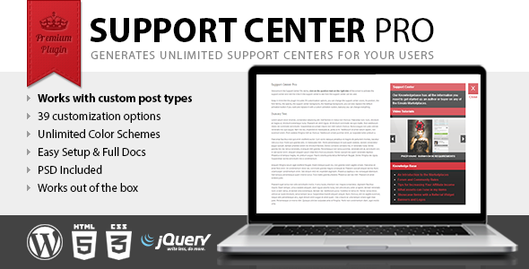
Support Center Pro is a new WordPress plugin that allows you to create custom support centers for your users, so they can have an easy access to your documentation or have specific tips related to the displayed content.
With Support Center Pro you will be able to create support centers related to specific posts, pages, custom post, or alternatively a single support center ( not associated with specific posts, pages, custom posts ) that will be used throughout your website.

Create your first support center
First of all, Support Center Pro make use of a new custom post type “document” and the related taxonomy ”class” useful to organize your documents, hence you should use this new custom post type for your documentation.
Then proceed to the actual creation of the support center, the Support Center Pro meta box will be available in your posts, pages, and custom posts and is organized in three different areas, general documentation, standard documentation, media documentation.
Customization of the support center
This plugin comes with 39 customization options, so you can change every single pixel displayed in the support center.
This is a list of the options available in the Support Center Pro menu:
- Activation Button Color: RGB color for the background of the activation button
- Background Color: RGB color for the background of the support center
- Headings Text Color: RGB color for the text of the support center headings
- Headings Background Color: RGB color for the background of the support center headings
- Activation Button Icon Color: RGB color for the icon in the activation button
- Text Color: RGB color for the text in the support center
- Links Color: RGB color for the links in the support center
- Gallery Elements Color: RGB color for the elements ( arrows background and caption background ) in the media documentation
- Gallery Text Caption Color: RGB color for the caption in the media documentation
- Gallery Text Caption Color Hover: RGB color for the caption on the hover event
- Gallery Elements Opacity: Opacity ( 0 to 1 ) for the elements ( arrows background and caption background ) in the media documentation
- Background Pattern: Background pattern for the support center
- Headings Background Pattern: Background pattern for the support center headings
- Activation Button Image Open (60×62): This image replace the default open activation button. To replace the default activation button with your custom images you should set both this option for the open status and the close option below for the closed status.
- Activation Button Image Close (60×62): This image replaces the default close activation button
- List Dots Image (10×20): This image replaces the default list dots, you can find the white and the black version in the plugin img folder
- Gallery Left Arrow (20×30): This image replace the default left arrow, you can find the white and the black version in the plugin img folder
- Gallery Right Arrows (20×30): This image replace the default right arrow
- Gallery Left Arrow Hover (20×30): This image replace the default left arrow for the hover event
- Gallery Right Arrow Hover (20×30): This image replace the default right arrow for the hover event
- Activation Button Text Open: If you are not using a custom image for the activation button with this option you can replace the default text
- Activation Button Text Close: If you are not using a custom image for the activation button with this option you can replace the default text
- Google Font: Here you can load a google font that will be used in the support center. Example: http://fonts.googleapis.com/css?family=Open+Sans:400,700
- Font Family: This is the font family used in the support center. Example: ’Open Sans’, sans-serif
- Opacity: Opacity ( 0 to 1 ) for the support center
- Border Radius: Here you can set a custom border radius that will be applied to the support center ( always ) and to the activation button ( only if you are not using a custom image for the activation button )
- Vertical Offset: This is the distance in pixel between the top of the viewport and the support center
- Horizontal Responsive Breakpoint: With this option you can select to hide the support center when the viewport width goes under a specific value in pixel, if for example you theme switch to the phone version at 380px you can set here the same value to hide the support center with the mobile version of your theme
- Vertical Responsive Breakpoint: With this option you can select to hide the support center when the viewport height goes under a specific value in pixel
- Horizontal Position: Here you can select to display the support center on the right of the screen or on the left of the screen
- Default General Documentation Title: The default general documentation title will be used as a default value for the related custom field in the Support Center Pro meta box
- Default General Documentation Description: The default general documentation description will be used as a default value for the related custom field in the Support Center Pro meta box
- Default Standard Documentation Title: The default standard documentation title will be used as a default value for the related custom field in the Support Center Pro meta box
- Default Media Documentation Title: The default media documentation title will be used as a default value for the related custom field in the Support Center Pro meta box
- Custom Post Type 1: If you are using custom post types and your purpose is to show the support center in your custom post types here you can set the custom post type slug to enable the support center. If for example you are using the “product” custom post type set “product” here and your users will be able to access to the documentation related to your products.
- Custom Post Type 2: Another slot for your custom post types
- Custom Post Type 3: Another slot for your custom post types
- Custom Post Type 4: Another slot for your custom post types
- Custom Post Type 5: Another slot for your custom post types
Create a generic support center
You should use this method only if your purpose is to create a single generic support center displayed throughout your website.
The generic support center can also be used as a fallback, in order to have a generic support center if there are no specific support centers.
To create a generic support center you have to enable the “Use in Template” option in the Support Center Pro meta box and paste the related function just before the body tag of your theme, usually located in the footer.php file.
<?php put_support_center(x); ?>
</body>
Credits
This plugin make use of the JavaScript Color Picker licensed under the GNU Lesser General Public License.
