
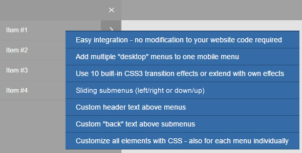

FancyNav converts desktop navigation lists to stylish mobile menus. You can combine multiple existing navigations to one responsive menu – or show more than one mobile menu on the same page of your website.
No changes to existing HTML and CSS code are required. Easy setup makes it possible to integrate FancyNav into any website.
Choose between ten transition effects for the opening/closing menus. Only CSS3 transitions are used, no jQuery animations.
And you can create custom effects as well.
All elements of the mobile menu can be styled with CSS – also individually for each menu.
FancyNav comes with two built-in skins. Multiple styling examples are included in the documentation of the download package.
More features:
- Open menus from the left or right side (works with all built-in effects)
- Elegant left-right (drilldown) or down/up sliding submenus.
- Custom text for the header above the menu items: for example to insert your company name or a logo with CSS.
- Define a back text above the submenus. By default FancyNav is showing the text of the parent link.
